SHINI 50 years logo story

Every brand, every company have a LOGO to make it memorable,
reliable and reflect a image of that brand and company.
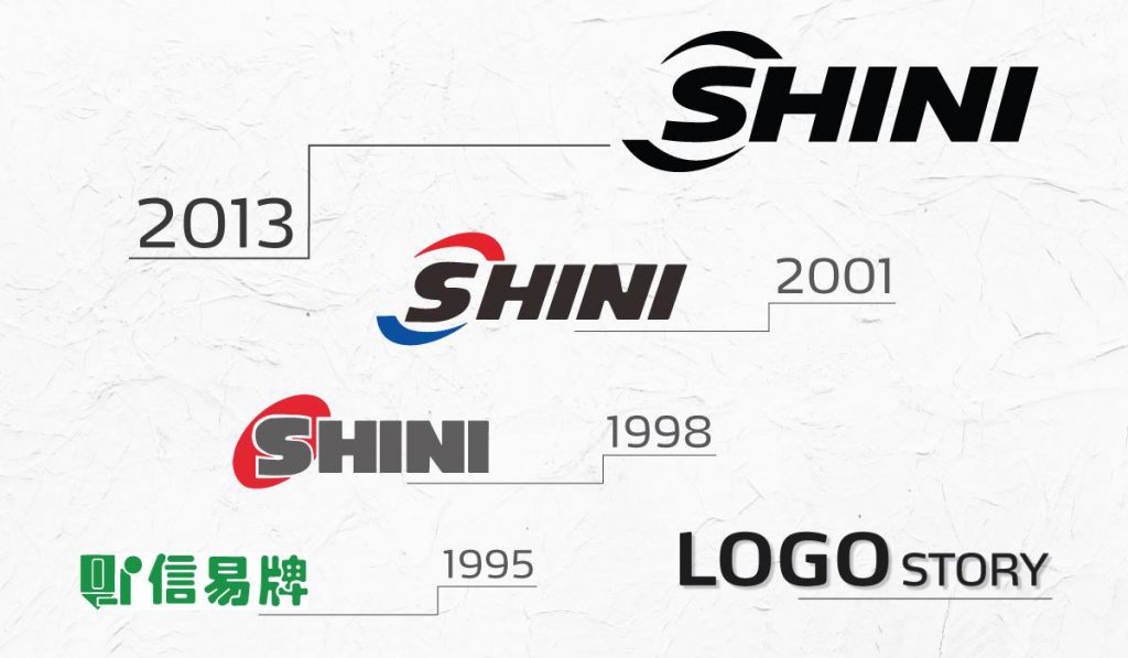
SHINI’s black logo must be familiar to everyone. However, SHINI has changed 4 types of logos for over the past 50 years. The first LOGO in 1995, SHINI has used LOGO in green Chinese characters. Later in 1998, SHINI has changed a LOGO from Chinese characters to the English alphabet and add a red ellipse behind the letter S. In 2001, SHINI still used the English alphabet but change a design and use 3 colors dark gray, red and blue.
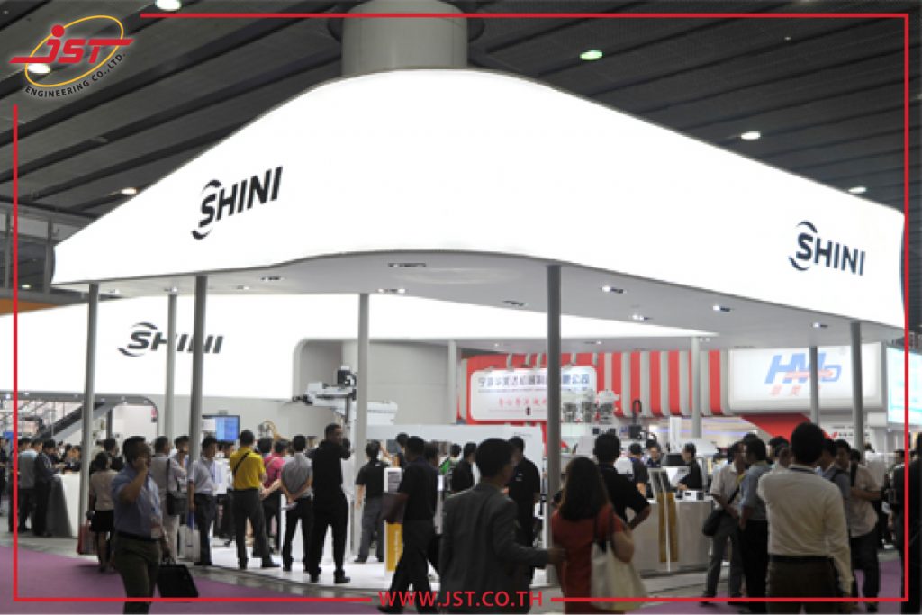
After growing and expanding to global market, SHINI change LOGO and rebranding in 2013. SHINI sets the format, color, font of everything – business cards, catalogs, manuals, or even exhibitions – in a similar way all over the world.
More information of SHINI auxiliary Click


